Wednesday, March 20, 2013
Tuesday, March 19, 2013
Sanchez incomplete
So....in a fit of genius, I emailed myself the wrong (incomplete) file....
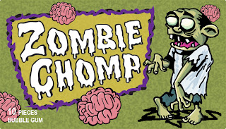
The final packaging has a zombie on it...
Asher - Readings
#4
Reading #4
Chapter 13 talks about designing websites that maintain a
balance of functionality, interactivity, and aesthetic. People (myself
included) have extremely short attention spans so its crucial that these
elements remain balanced. The internet has taken over the world and you have
short increments of time to make users interact. The hierarchy of logical
information must be in order so that people don’t lose interest. Being able to
make everything concise as possible is key.
Chapter 14 talks about designing for mobile devices. Smart
phones have also taken over the world and most people become lost in them and
are constantly interacting with them, (myself included.) This is a golden
opportunity for advertising. R.U.L.E. is an extremely useful tip that applies
to every field of design and forces one to really think of how to grab someones
attention and engage them through a visual medium.
Chapter 15 is all about social media and various forms of
marketing. Social media is an entirely different ball game than other types and
the R.A.V.E.S. rule like R.U.L.E can also be widely applicable to all fields of
design. The most interesting concept is the idea of ambient advertising, which
places ads in a unique spot or context to intrigue people. It incorporates existing spaces and
structures to promote a project. Ambient advertising projects are what I would
hopefully like to work on some day if I ever work in advertising.
#3
Chapter 5 talks all about how to think creatively and
generate new ideas through the “Concept Generation Process” (prep stage,
incubation period, illumination, verification)which logically breaks down how
one can interact to come up with new ideas. This process is extremely useful
and has opened up my mind a bit on how one should go about facing a creative
mental block. Sometimes simply stepping away for a bit can be all that one
needs. The chapter also talked about symbolism and visual analogies. Symbolism
requires consumers to already know inherent information so that when they read
the ad, they interact with it by feeling like they apart of something.
#2
Chapter 7 focuses on the presentation of advertisements and
how to be innovative. Attention spans are becoming shorter and shorter and
visual pollution is at an all time high. We are constantly bombarded with
visual garbage that our minds completely skim over because it is so far off our
mental radars. You’re not gonna be able to sell any products without getting
anyones attention first. Chapter 8 focused mainly on typefaces and on how /
when to choose them. There are endless amounts of typefaces and every miniscule
little detail matters with type from the spacing to placement to tracking to
kerning to leading. This was simply a reminder of the importance in advertising.
Chapter 9 is all about composition and how ads should be properly structured to
attract the attention of a consumer through a balanced visual hierarchy.
#1
Whether we believe it or not our lives are greatly
influenced by the advertisements around us. People are always trying to sell
something, at every corner and every turn. Signs, product placement,
newspapers, billboards, tv, internet ads – any medium that one could possibly
imagine. This book really just describes the essence of what drives designing
advertisements. Landa states in the book that advertising is
“a specific message constructed to inform, persuade, promote, provoke, or
motivate people on behalf of a brand or group.” The next chapter explains the
six phases of an advertising project process- (overview, strategy, ideas,
design, production, implementation)
A good example of product placement would be Lil Wayne’s
brand Trukfit, which he created so he can rant about it in his songs and wear
it in his videos to promote.
Chinbayar Davaatseren, Final Givenchy
Givenchy logo was bit of a challenge for me, because its logo and brand is already well established and elegant to very high class customers. However, Looking at its logo, it gave me feeling of fluidity and gives me a feeling of Celtic Jewelry, which is usually designed with a pattern (endless knot). So I redeveloped the logo to this square shaped logo, that is endlessly knotted , and my main concern was to keep the fluidity ( property of flowing easily)
Subscribe to:
Comments (Atom)


