Another approach that I found interesting was the gags, stunts, and pranks option. Initially, I couldn't think of a commercial featuring a prank but then remembered the Febreze blindfold commercials. People are put in really gross environments and tricked to believe their not based on the scents manufactured by Febreze.
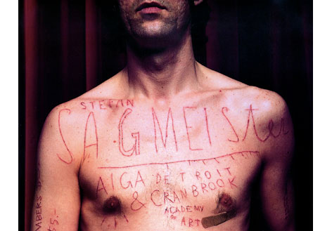
In chapter 8 typography and visualization were discussed at large. They discuss the selection of typeface and when one typeface is more appropriate over another. There is a 'voice' associated with each typeface. A handmade typeface vs. say, Helvetica or even found type speaks volumes on the mood of a piece. When it comes to type I naturally think of Stefan Sagmeister's work. He works almost exclusively with his own handmade type creating beautiful pieces that convey a very grunge/organic feel to his pieces. He also works with found imagery creating unique typographic pieces.
In chapter 9 composition is discussed in regards to the way an ad is constructed. The layout of an ad is extremely important and can determine just how effective it is. Visual hierarchy, in particular, is crucial. At a glance people are supposed to be able to identify what is being advertised. The first thing identified should be the product or service and everything else should come second. The Brad Pitt Chanel No. 5 ads so a great job simplifying the message. They're selling perfume; plain and simple. The background, including Brad Pitt, is in grayscale while the bottle is in full color and larger in size. Automatically the viewer's eyes are drawn to the bottle.

No comments:
Post a Comment