Chapter 7 introduces us to the idea of approaches, moreso to the idea of how to creatively innovate in a way that hasn't been done before. We constantly see ads that we pass by without a second glance, which are a result of similar thinking. These are ads that don't really go out on a limb to try and do something new and different creatively. We were shown how new and different thinking paid off for other people, such as the Sephora makeup line and FedEx's infotainment campaigns. I was then drawn to Sony's campaign behind the two devices that are extremely small. The first, a camcorder, was so small it could be hidden behind a hand. The other, the walkman, so small yet capable of downloading songs from the internet. Both of these have one thing that could have been used for their advantage: their size. Rather than using an ad that simply shows depth or perhaps a comparison in size using their products, Saatchi & Saatchi took a different route. The camcorder wasn't even shown in the ad. All that was displayed was a vertical-facing hand with the strap around it, implying the camcorder was behind the hand. This is an extremely useful technique to imply the size of the camcorder, which was the focal point of the product. The walkman, not only focusing on size, but the ability to download music, was shown with a user with nothing but the headphones in which are leading to the sky, off the image. This implies that the music is coming from the sky, or a much bigger source in this case. While both of these products could have been showcased in overdone ways for their size, they were both treated in a different way and warranted much greater results.
Chapter 8, focusing on typefaces, brings to light much needed information about how to choose a particular typeface, selecting the readability of a typeface (sometimes unreadability is necessary), and then effects that can be applied under certain circumstances. The thing that really caught my eye in this capter was the part about mixing typefaces. From the Ink! Coffee ads, we see a combination of typefaces through different images that make up the copy for the ads. The first image, which I thought was more effective, reads, "All the caffeine, none of the corporate globalization. Wake the hell up!" This ad spoke to me on two levels. First, the obvious one from reading the copy was breaking away from the big-time coffee shops to support their local ones. This was very clear as the copy was bold and loud. The second one, though, was perhaps accidental. We could recognize the Starbucks, Caribou coffee font, or the Dunkin Donuts font extremely easily. This ad, using a bunch of different typefaces, perhaps from diners or local shops, completely breaks down the idea of corporate world coffee and implements the idea of mom-and-pop shops. I thought this was a very effective idea.
Chapter 9, focusing on composition and the organization of elements within a creative, allows us to see great examples of how objects and images should be laid out within the ad. The e-campus ad, which uses two identical ketchup bottles is laid out in such a way that we may look at two identical objects differently, which was the point of the ad. In one image, the ketchup bottle has copy next to it that says "condiment" and the other one reads "spaghetti sauce." Using two identical images, but placing them in different parts of the space allows the reader to see them differently (with the help of the copy). This method is extremely effective when needing to utilize the space of the ad.
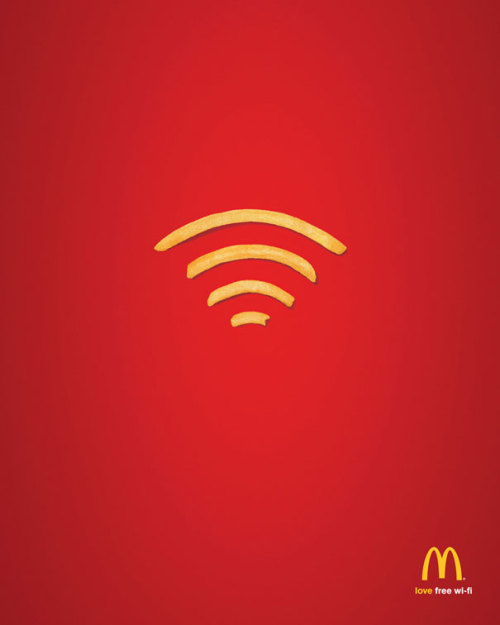
The McDonalds ad utilizes great composition. Centered, are 4 french fries made out in the form of the wi-fi symbol, implying that McDonald's now uses free wi-fi in their restaurants. They don't need to use much copy because they took two (or three) well-known images and put them together. The wi-fi symbol is something most of us have come to recognize, and the fries are something we all know as well. Using the composition of color schemes for this ad, we can tell without even looking in the bottom right corner that this is a McDonald's wi-fi advertisement.
No comments:
Post a Comment